


iOS Control Center - Panel
Byte Bloom
When I first tried iOS Control Center - Panel, I approached it as a practical replacement for repeatedly digging through Android settings. It is a free personalization app from Byte Bloom that brings an iPhone-inspired quick-access panel to Android, and its appeal is easy to understand: everyday controls are placed behind one gesture instead of several taps through menus.
The important distinction is that this is not an Apple utility and it does not turn Android into iOS. It is an Android customization tool built around the look and idea of an iOS Control Center. In my experience, that makes it most useful for people who care about a cleaner, more immediate way to reach common controls, rather than users searching for a complete operating-system makeover.
The app has passed half a million installs and carries an average rating of 3.4 from roughly a thousand ratings. That combination tells me there is clear interest in the concept, but also that the experience will not suit every phone or every user. I would treat it as a tool worth testing carefully, not an automatic upgrade for every Android device.
How the panel fits into an everyday Android routine
A simple replacement for repeated trips into Settings
The baseline workflow is straightforward. Instead of opening Settings whenever I need a frequently used control, I use the panel as a quick access layer. That can be useful when I am moving between Wi-Fi networks, adjusting brightness, checking a connection, or changing another system option that I normally reach from the notification shade or a settings page.
This matters most during small interruptions. Imagine leaving home while listening to a podcast: I may need to check connectivity, lower brightness, or reach another shortcut before walking outside. A dedicated panel reduces the number of places I have to remember. It does not necessarily make every action faster than Android’s own tools, but it gives those actions a consistent visual home.
Related News

Why WhatsApp Messenger Still Makes Everyday Communication Feel Easy

Jurassic World: The Game Is the Better Dino Tycoon for Strategic Players

Threads in Real Life: Who Should Join, Lurk, or Leave

How SHEIN Turned Shopping Into an Endless Content Feed

How to Make Fortnite Feel Smarter on Mobile

Should You Switch to Microsoft Outlook on Mobile?
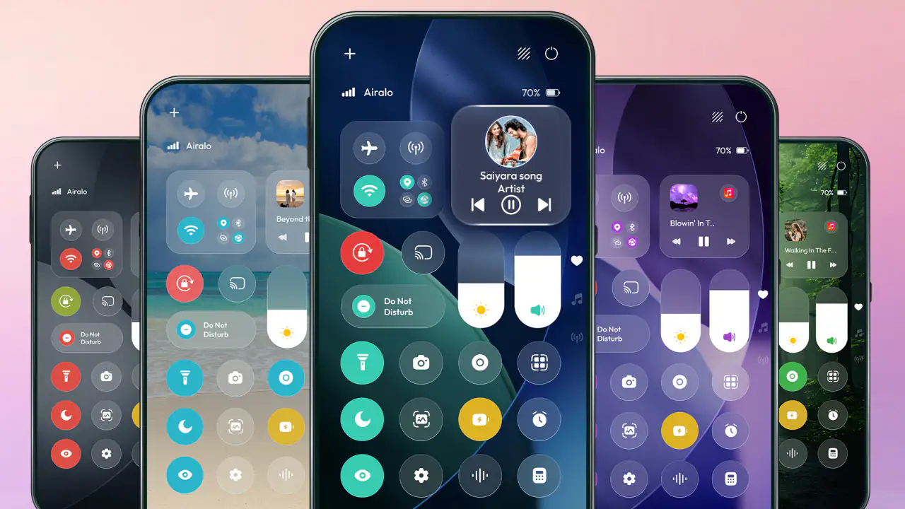
The iOS-style presentation is also part of the experience. The panel feels more deliberate than a plain list of toggles, which can make common controls easier to recognize at a glance. I found that useful when I wanted to act quickly rather than read through a full settings screen. However, the visual resemblance should not be confused with identical behavior. Android still controls the underlying functions, so the result depends on the phone and its version of the operating system.
Where it sits beside Android’s built-in shade
Android already provides quick settings, and on many phones that built-in shade is difficult to beat for reliability. It is integrated into the system, familiar, and usually available without adding another layer. The real reason to try this app is therefore not simply access to toggles. It is the combination of a different layout, an iOS-inspired appearance, and a more focused personalization experience.
For me, the choice comes down to habit. If I already use the notification shade comfortably and rarely change system controls, this panel adds little. If I dislike the arrangement of my manufacturer’s quick settings or want a more iPhone-like interaction style, it becomes more interesting. The app is best viewed as an alternative front end for quick access, not a replacement for Android’s core settings.
Gallery
What the free download means in practice
The app is free to install, which makes experimentation relatively easy. It also includes in-app purchases priced from $16.99 to $30.70 per item. That is a wide enough range that I would avoid assuming every customization is included with the free experience. Before building my whole routine around it, I would spend time with the available controls and decide whether the basic panel already solves my problem.
This is especially important for a personalization app. A panel can look promising in screenshots but become unnecessary if the free arrangement does not match the way I use my phone. I would first test it during normal activities—commuting, switching audio devices, adjusting brightness, and checking connections—before considering any purchase.
Settings that deserve attention before daily use
The first setting I would examine is the panel’s access method and placement. A quick-access tool only helps when its gesture or handle is easy to trigger without getting in the way of ordinary navigation. If the access area sits where I commonly swipe, tap, or scroll, the convenience can quickly turn into accidental openings.
I would also check how the panel behaves over different apps. A control surface that feels comfortable on the home screen may be awkward over a keyboard, a game, a video player, or a full-screen document. My practical advice is to test it in the three apps I use most, not just in the launcher. That reveals whether the panel supports my routine or competes with it.
Another useful check is the visual balance. An iOS-style panel often depends on spacing, contrast, and recognizable icons. If the design is too bright at night, too crowded, or difficult to read against certain backgrounds, the attractive concept loses some of its value. I would adjust the appearance until it remains readable without making the screen feel busier than Android’s own shade.
Because the app is categorized under personalization, I would think about it as part of the phone’s overall interface rather than as a one-time utility. The best result comes from choosing a stable arrangement and leaving it alone for a few days. Constantly changing the layout may feel productive, but it can make muscle memory less reliable.
Building a repeatable control routine
Experienced use is less about opening every available shortcut and more about deciding which actions deserve immediate access. I prefer a small set of controls that I can identify without hesitation. For example, if I regularly change brightness, manage wireless connections, and adjust sound, those should be easier to reach than options I touch once a month.
A helpful routine is to group actions by situation rather than by technical category. Before leaving home, I may want connectivity and brightness. During work, I may care more about sound and distraction-related controls. At night, brightness and audio become more important. The panel is more valuable when it supports these repeated moments instead of becoming a decorative collection of buttons.
This approach also exposes one of the app’s trade-offs. A visual panel can make many controls feel equally important, while my actual routine is usually narrow. If I keep adding shortcuts because they are available, I create visual noise and slow myself down. The strongest setup is often the least crowded one.
Faster patterns that save small amounts of time
The first faster pattern is deliberate placement. I would put the access point on the side or area of the screen that matches the hand I use most, while avoiding the edge where Android’s navigation gestures are active. That small adjustment can make the difference between a reliable swipe and repeated failed attempts.
The second pattern is to use the panel at transition points. Opening it while starting a trip, entering a meeting, switching from mobile data to Wi-Fi, or preparing to watch something creates a natural checkpoint. I do not need to keep it open or interact with it constantly. I use it as a short routine that prevents me from forgetting a basic adjustment.
The third pattern is to pair it with Android’s existing tools rather than trying to replace everything. I might use the panel for the controls I change often, while keeping the notification shade for notifications and the full Settings app for less common options. This division avoids forcing one interface to handle every task.
That hybrid approach is more effective than chasing a perfect iOS imitation. Android’s built-in tools remain better suited to deeper changes, account management, app permissions, and system-level configuration. The panel earns its place by making a small group of repeated actions feel more immediate.
A realistic day with the app
Consider a typical workday. In the morning, I check a connection and adjust brightness before leaving. At the office, I lower sound and make another quick change before opening a meeting app. Later, I reconnect to a different network and raise brightness while working away from my desk. In the evening, I reduce brightness again and adjust audio before watching a video.
None of these actions is difficult on Android. The benefit is that I can approach them through one consistent panel instead of remembering whether a particular control is in the notification shade, a manufacturer shortcut, or a full settings page. That consistency is the app’s strongest practical argument.
There is also a limit to the time saved. If my phone already places these controls in an easily reachable shade, the difference may be mostly visual. The app becomes more worthwhile when the default arrangement is inconvenient, when I want a different style, or when I frequently move between controls that are separated in the standard interface.
What advanced users should not expect
The biggest limitation is the boundary between a customization layer and the Android system itself. An iOS-style panel can present access to controls, but it cannot automatically make every Android function behave exactly like an iPhone feature. Manufacturer software, navigation settings, screen dimensions, and the Android version can all affect how natural the experience feels.
I would also avoid treating the app as a universal solution for automation. A quick-access panel is useful for reaching actions, but that does not mean it will create complex routines or replace dedicated automation tools. Users who want conditional behavior, scheduled changes, or elaborate device workflows may be better served by Android’s automation options or a specialized utility.
Another trade-off is interface layering. Every additional overlay has the potential to compete with something else on the screen. A game, drawing app, camera interface, or edge-based navigation gesture may expose weaknesses that are invisible during casual testing. If I spend a lot of time in full-screen apps, I would test those first and keep the access area as unobtrusive as possible.
The purchase structure is another reason to be selective. Since individual in-app items can be expensive for a personalization tool, I would not pay simply because the panel looks polished. I would first identify a specific problem—such as an awkward quick-settings layout or a strong preference for the iOS-style presentation—and then decide whether the paid option directly addresses it.
Compatibility and suitability across users
The app supports Android 8.0 and newer, so it covers a broad range of devices. Still, support for an operating-system version does not guarantee an identical experience across brands. A Samsung, Motorola, Pixel, or other Android phone may handle overlays, gestures, and system controls differently. I would judge the app on the phone I actually use rather than on the general promise of compatibility.
Its Everyone age rating makes it approachable for a wide audience, including people who simply want a more familiar-looking control panel. That does not mean it is equally suitable for everyone. Someone who values maximum battery simplicity, minimal overlays, or a completely stock interface may prefer to stay with Android’s built-in options.
On the other hand, people moving from iPhone to Android may appreciate the visual familiarity. It can make the transition less abrupt, especially for someone who misses the feeling of reaching common controls from one compact surface. I would still encourage new Android users to learn the native notification shade and Settings app as well, because those remain essential when the custom panel is unavailable or insufficient.
How I would troubleshoot the experience
If the panel feels unreliable, I would start with positioning rather than immediately blaming the app. Moving the access area away from navigation gestures, testing it with a different grip, and trying it over several apps can reveal whether the problem is interaction design or system behavior.
If the interface feels cluttered, I would remove anything I do not use weekly. A smaller set of meaningful controls is easier to scan and less likely to cause accidental taps. I would also avoid changing the arrangement every day; a stable layout gives the hand and eye time to learn it.
If the app does not improve my routine after several days, I would remove it without hesitation. Personalization should make the phone feel more natural, not create another habit to maintain. Android’s standard shade is the better option when it already provides the controls I need with fewer layers and no extra purchase decisions.
My final view after using it as a daily tool
iOS Control Center - Panel is a focused personalization app with a clear purpose: it gives Android users an iPhone-inspired quick-access experience. Byte Bloom has aimed at a familiar interface idea rather than a complete system transformation, and that focus is sensible. The app is most convincing when I use it for a small, repeatable group of actions throughout the day.
I would recommend trying it if the standard Android shade feels poorly arranged, if you prefer the iOS visual style, or if you are adapting to Android after using an iPhone. I would not recommend it automatically to users who are satisfied with their phone’s native controls, dislike overlays, or expect advanced automation and deep system integration.
The current release is version 1.0.10, and the average rating of 3.4 suggests a mixed experience rather than universal approval. I read that as a reason to test it on my own device, not as a reason to dismiss it. A personalization tool can be highly useful for one person and unnecessary for another because the value depends so heavily on daily habits.
My preferred setup is simple: place the access point where it does not interfere with navigation, keep only the controls I use regularly, and treat the panel as a companion to Android’s native tools. Used that way, it can make repeated adjustments feel smoother and give an Android phone a more iOS-like rhythm. Used as a promise to recreate an entire operating system, it will probably disappoint.
In the end, this is a worthwhile free experiment for people who want a cleaner quick-access routine, but it is not an essential Android installation. The real advantage comes from a disciplined layout and repeatable habits, not from filling the panel with every possible shortcut. That is the difference between a useful daily layer and another interface that looks good but gets in the way.
FAQs for iOS Control Center - Panel
What is iOS Control Center - Panel and what does it do?
iOS Control Center - Panel is an Android customization app designed to imitate the appearance and quick-access behavior of Apple’s Control Center. After installation, it can provide an on-screen panel for shortcuts such as Wi-Fi, Bluetooth, brightness, volume, screen rotation, flashlight, and other frequently used settings. It is mainly intended for users who want an iPhone-inspired interface without changing their entire Android operating system.
How do I open and customize the iOS-style Control Center?
The panel is generally opened by swiping from a selected edge or area of the screen, depending on the configuration chosen inside the app. During setup, you may be able to adjust the activation handle, position, size, transparency, colors, and available shortcuts. It is worth spending a few minutes testing these options because an overly sensitive trigger area may interfere with navigation, gaming, or other apps.
Does iOS Control Center - Panel require special permissions?
Most iOS-style control panel apps require permissions such as displaying over other apps so the panel can appear above the current screen. Some features may also request access to accessibility services, notifications, or device settings. These permissions should be reviewed carefully before enabling them. Only grant access that is necessary for the features you intend to use, and revoke permissions later through Android settings if you stop using the app.
Can this app control every Android setting like the real iPhone Control Center?
No. The app can offer convenient shortcuts, but its capabilities depend on the Android version, device manufacturer, and permissions available to third-party applications. Some controls may open the corresponding system settings instead of changing them instantly, while others may not work on certain phones. The interface is primarily a visual and practical imitation, not an official replacement for Android’s built-in quick settings.
Is iOS Control Center - Panel free and safe to use?
The app may be available to download for free, although it can include advertisements, optional purchases, or additional features that require payment. Before installing, check the listing’s developer information, recent reviews, update history, and requested permissions. Because the panel operates over other apps, users should avoid downloading modified versions from unofficial websites and should install only from a trusted app store whenever possible.
Pros
- Quick access to Wi‑Fi
- Bluetooth
- Airplane Mode
- and other controls.
- Useful shortcuts for screen recording
- flashlight
- calculator
- and camera.
- Brightness and volume sliders are easy to adjust with one swipe.
- Media playback controls work conveniently from the Control Center.
- Layout can be customized on newer iOS versions for faster access.
Cons
- Some controls require an extra tap or long press to reveal more options.
- The interface may feel crowded on smaller iPhone screens.
- Certain settings still open the Settings app instead of changing instantly.
- Control Center access can be disabled inside apps
- limiting quick access.
- Accidental swipes may interrupt gameplay or other full-screen activities.


